Whatever sport you are into – it doesn’t take much to get started.
Decathlon’s mission is to make sports accessible to everyone, championing the athlete in all of us. This campaign shows that getting started takes very little.
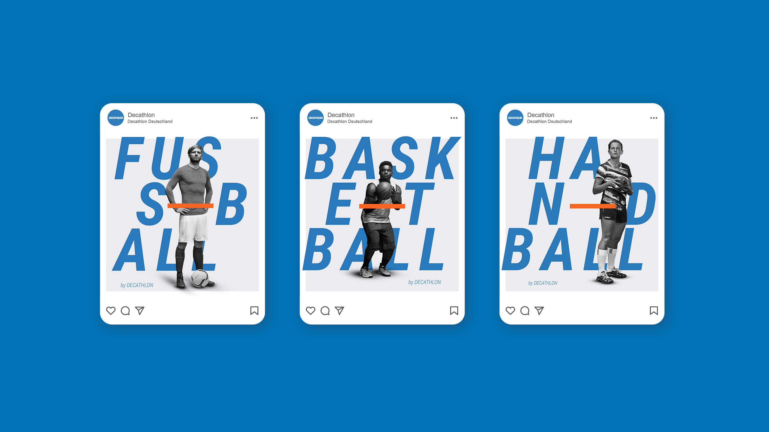
Design system
For the new campaign, we created posters and billboards designed to captivate and inform. While the initial phase focused on team sports, we needed a flexible design system to showcase Decathlon’s entire product range.
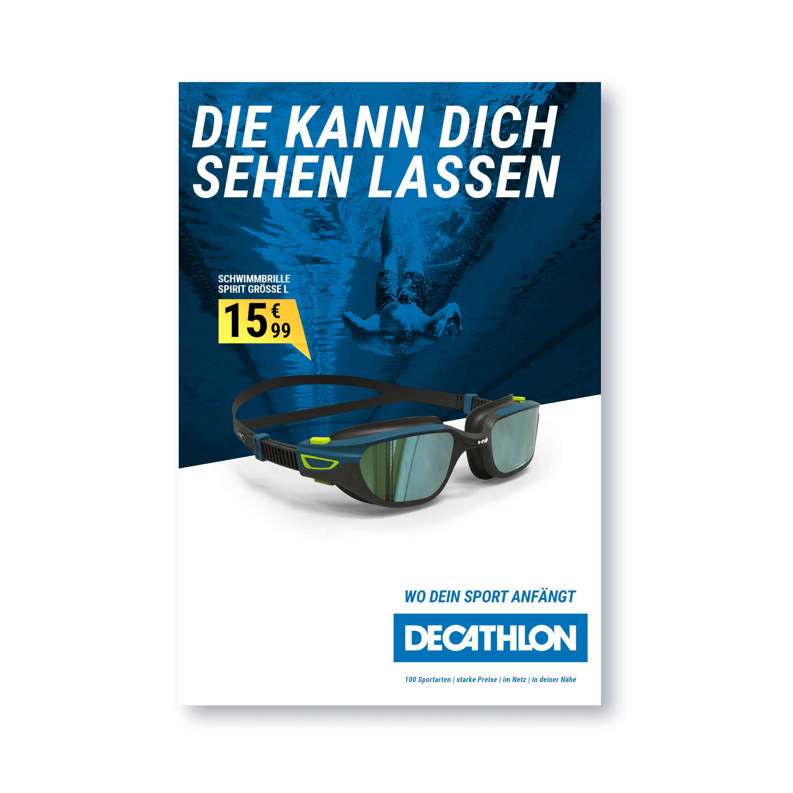
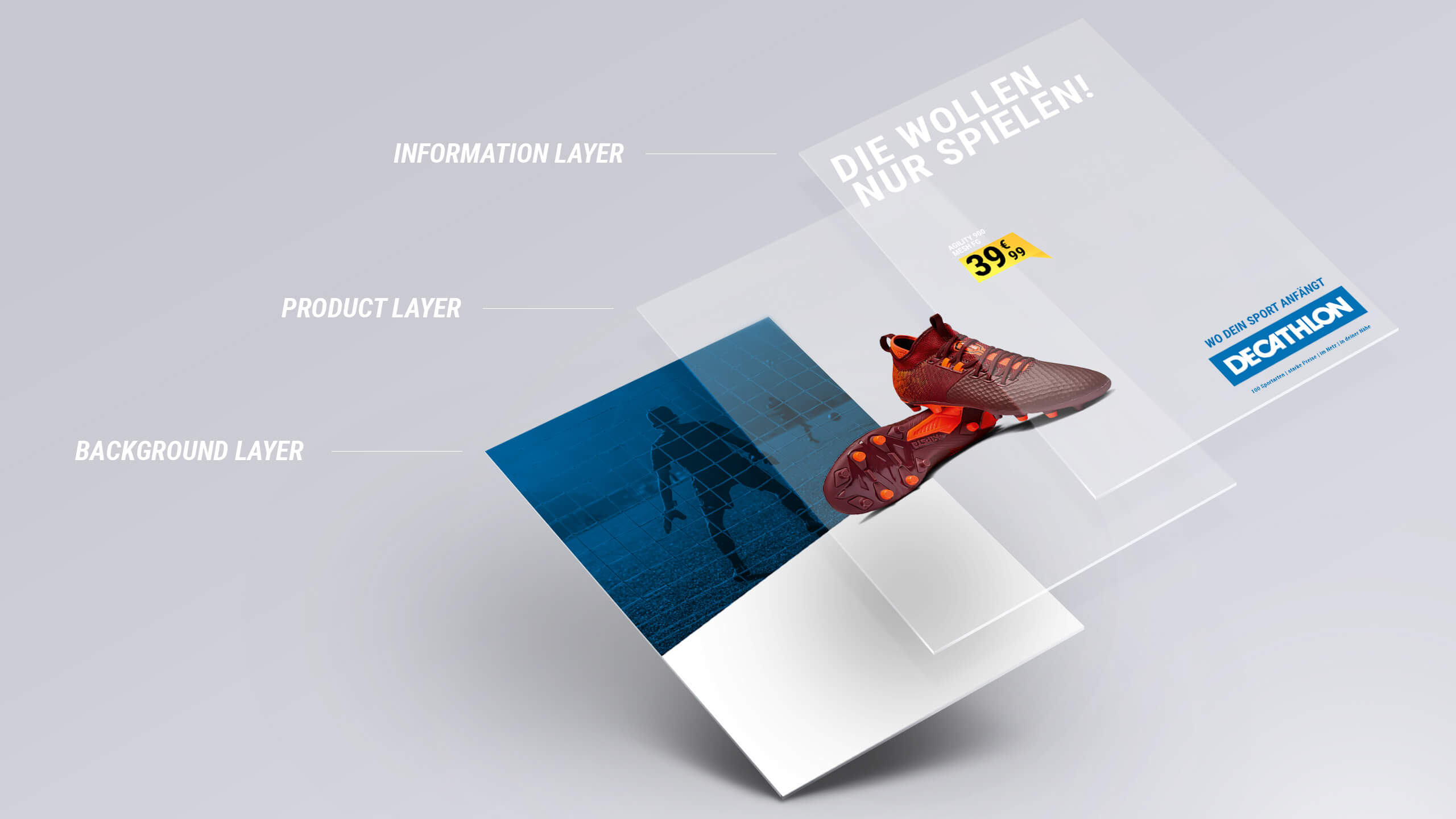
The solution was a layered system that treated all products equally. The background sets the mood, showcasing the product in action, while Decathlon’s signature blue overlay ensures harmony without competing with other elements. Products are isolated and displayed on a versatile 'stage' that accommodates items of any size. Finally, product details, pricing, and a playful headline bring the design to life.
This approach delivers a campaign that’s visually engaging, consistent, and adaptable for any product.

Headline: They just want to play.
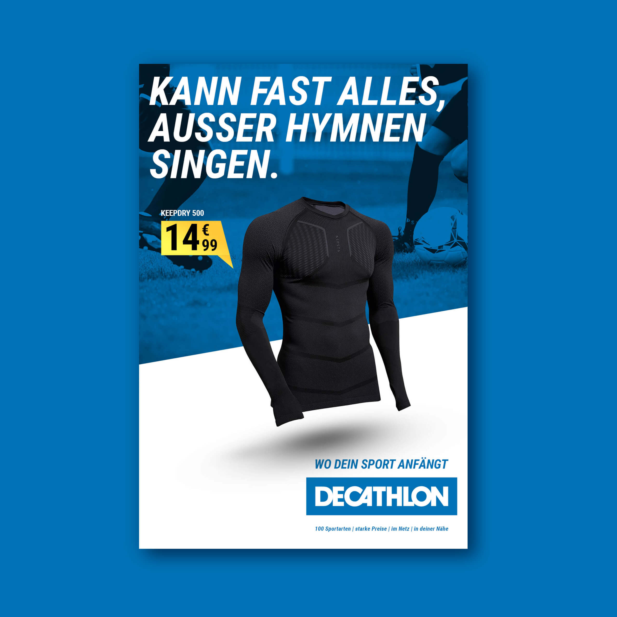
Headline: Handles everything except singing hymns
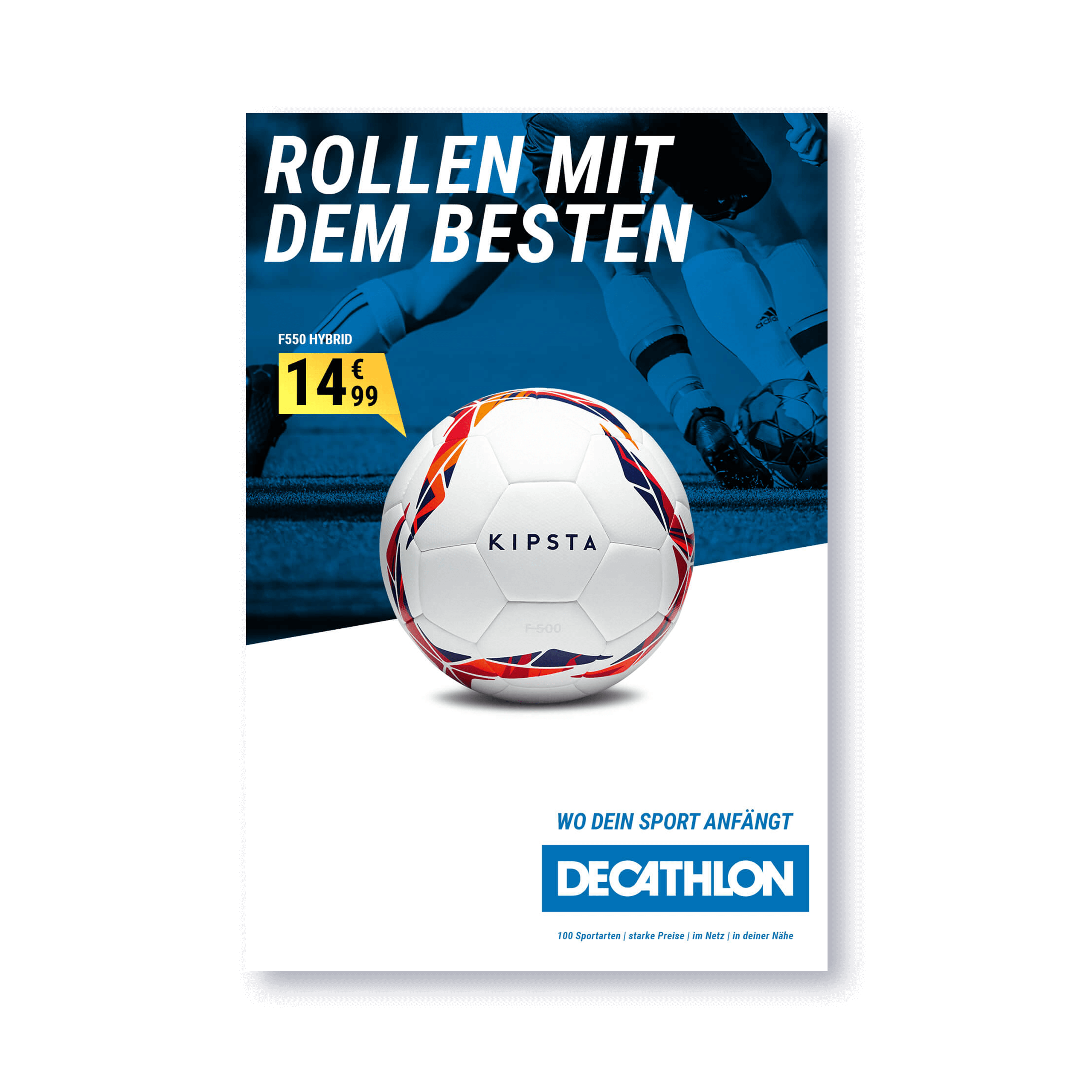
Headline: Rolling with the Best
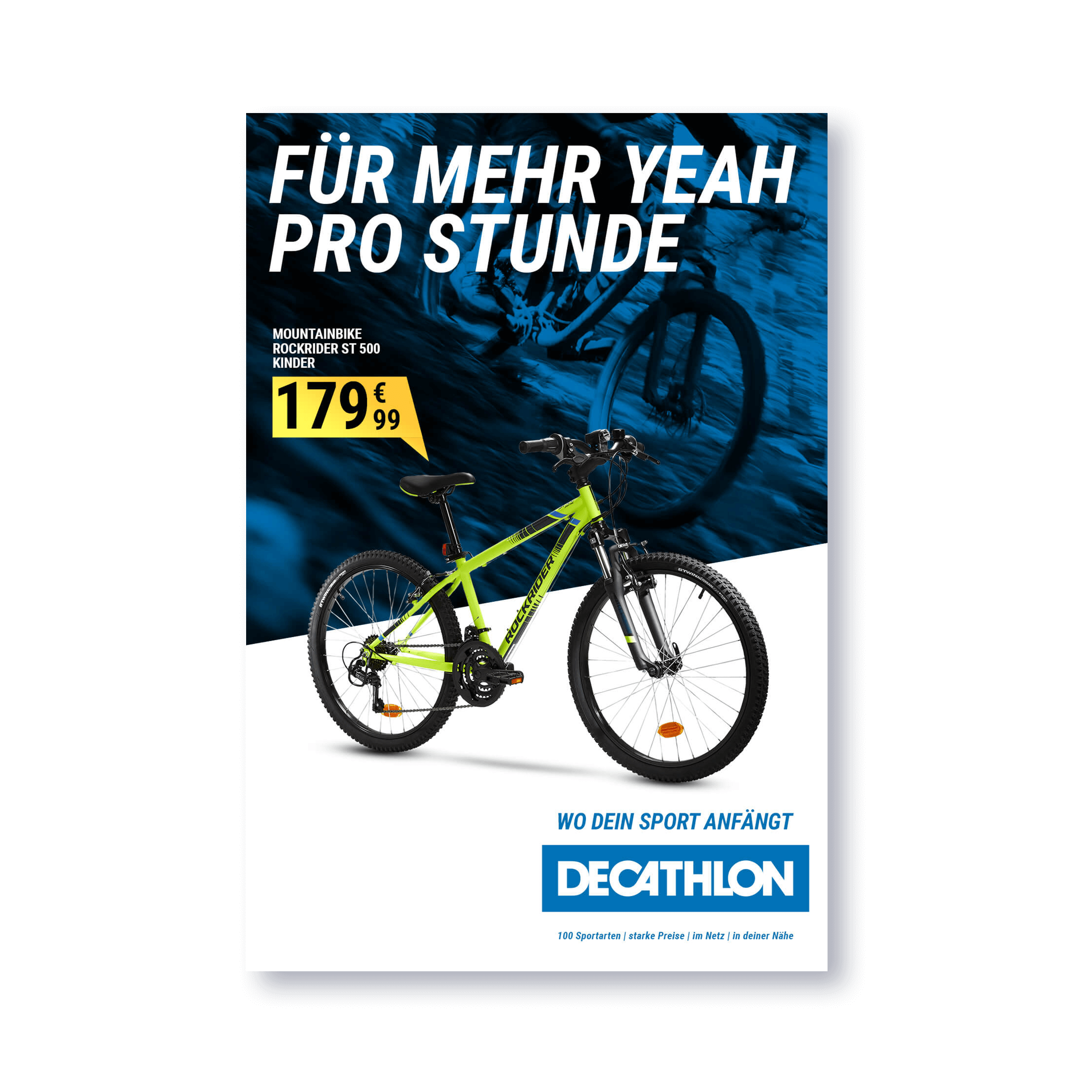
The products below were not part of the campaign but are included in Decathlon’s range. These ads served as proof of concept, showcasing the versatility of our design system to present both small and large products in a consistent and engaging way.
My Role: Senior Art Director
Director: Carlo Oppermann